
Form elements - checkbox, radio button and CSS
What is the difference in the web form elements checkbox and radio button, what are the possibilities to modify their appearance by using the attributes and CSS properties, or why it is not possible to remove the border of checkbox, are going to be answered in this article. Further, experimental muliple state checkbox, based on current HTML text box is demonstrated.
Live form which follows is appended by corresponding CSS code and is intended for comparison of live form in your actual browser with screenshots from other browsers. Light gray color in form limits the space occupied by elements and in addition helps to highlight white parts of form elements.
|
|
| default shape: <input type="checkbox">, <input type="radio"> | ||
|
|
| <input type="checkbox" disabled>, <input type="radio" disabled> | ||
|
|
| .backgr {background: #ffa; color: #00f;} | ||
|
|
| .reset {margin: 0; padding: 0; float: left; border: 0;} | ||
|
|
| .size20x20 {width: 20px; height: 20px; ...} | ||
|
|
| .size36x24 {width: 36px; height: 24px; background: #ffa; color:#0a0; ...} |
Browsers render described elements as bitmaps. Set size, border and color with help of cascading style sheets is possible only when these elements and their parts actually rendered. Unfortunately, this can be done in Opera only. Other browsers take over the look of these elements from Windows with all its shortcomings.
Sreenshot on the left are IE8 in classic theme (motive) and in Windows7. Other screenshots are examples of that form in currently used browsers running in Windows XP. Screenshots in older browsers are here.
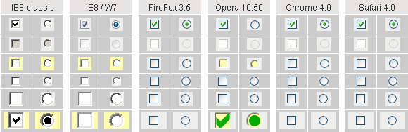
Top two rows of screenshots display the elements in unaffected state, without the use of cascading style sheets. In the second row is element in status disabled.
Most of form elements can be switched to the classic look by property background. Only IE and Opera use this option, although they differ in concept what the background is. You see the situation in the third row of screenshots where property background: #ffa; is set up.
Empty space around the elements (light gray color) is sensitive to mouse click in IE only. Removing of that space can be done by properties margin: 0; padding: 0; float: left;. Property border: 0; is set to prove if the border can be removed. Result is displayed in the third row of screenshots.
The last two lines of examples are testing possibility of setting dimensions by help of CSS. Square size of 20x20 pixels is reflected only in IE. Rectangular size of 36x24 pixels are reflected in IE and Opera, thanks to property background which switches elements in Opera to the classic appearance. Elements are drawn as square and filled to required rectangle by blank, on click sensitive space.
A clear winner is the Opera browser. Possibilities of styling form elements checkbox and radio button in Opera browser is much better than the simple test on this page. See how to set the look of checkbox and radio button in the Opera browser.
Attributes of elements checkbox a radio
<input type="checkbox" name="ch" value="yes" />
type="checkbox" attribute is mandatory for this type of form element. Each checkbox should have unique identifier name="...", like all other form elements. Attribute value="..." is sent to the server as the part of pair name=value. According to our example above, ch=yes is submitted. If attribute value is omited, default value on is used. Remember, only selected element (check mark is displayed) is submitted to the server. When the checkbox is not selected, no information is submitted to the server.
<input type="radio" name="rd" value="1" />
<input type="radio" name="rd" value="2" />
type="radio" is a required attribute for this type of form element. All radio elements, which are members of one group have to use the same attribute name="...", but attribute value="..." have to be distinct for each element in that group. Browser ensures that only one radio button in the group is selected at a time. To the server is submitted only one pair name=value for entire group of radio buttons, where value is according to selected radio button.
checked is an optional attribute for tags checkbox and radio button. When the initial status of the element is to be selected, this attribute attaches check mark to element when page is loaded into browser. Group of radio elements should be in the definited status: one element of the group should have set the attribute checked.
disabled is an optional attribute for tags checkbox and radio button. Status disabled identifies element as not accessible, or that has no meaning in given context. Elements checkbox and radio in status disabled are rendered as grayed and are not submitted to server for processing. One remark: attribute readonly is not defined for elements checkbox and radio according to W3C.
A few notes
Form element checkbox is used to handle binary logic and it is an independent element in the form. Radio button on the other hand is always member of the group of radio buttons and serves as status switch. Only one radio button in the group can be selected. The different purposes of both element types have to be respected and they are not interchangeable.
Single element radio , (outside of group), can be selected, but not deselected. Such an element does not make sense. There is no way to deselect all members in group of radio elements, such a situation also makes no sense. Use attribute checked to select default radio button.
Browsers render described elements as a set of images in dependence on its status. Border and content are not rended separately as in case of other form elements. Border is in the bitmap so is not removeable. Although in classic look of form, the size of elements can be set, but it is essentially element zooming. Indeed, zoom change the border size too.
Experimental checkbox
Customizable checkbox can be created by help of textBox element, controlled by JavaScript. When font size is changed, element size is changed too (so-called accessible element). Such experimental checkbox has its own drawbacks - it does not look like typical checkbox and unskilled user can be confused. To compare the functionality of classical, experimental and multi-status checkbox boxes, try following live form demo.
In IE browser at rapid clicking some mouse clicks are evaluated as double-click (also for classic checkbox). Differences in browsers event processing are described in Javascript Madness: Mouse Events.
CSS ...
.inp2 {margin: 0; border: 0; padding: 0; background: #ffa;
       font: bold 100% Arial, SansSerif, Verdana; width: 1.1em;
       text-align: center; cursor: default;}

JavaScript ...
function swBox(box) {
  x = document.getElementById(box).value;
  document.getElementById(box).value = (x == "X") ? "" : "X";
}

HTML ...
<a href="javascript: swBox('c2')">#2, two state text box</a>

<input type="text" name="c2" id="c2" class="inp2" value="X"
 readonly="readonly" onclick="return swBox('c2')">
Experimental checkbox consists of two parts situated in table cells. The first one (optional) descriptive text simulates element label for, the second one is form element input type="text". Important attribute readonly prevents user to type text right in the text box. Either part, when clicked by mouse, fire JavaScript swBox('c2') function. Parameter c2 is text box id.
JavaScript function simply switches text box content between letter "X" which is used instead of check mark and empty content. Letter can be substituted by text (yes/no). In some cases text is more appropriate than graphics check mark. For multi status checkbox script, refer source code of this page please.
Small difference is in content of form submitted to server. While classic checbox submit element name and its value only when activated, described experimental checkbox submit name and value every time. In our example it is string "c2=X" in case of checked, or "c2=" in case of unchecked status.
updated 2023-10-31