
Uniform form look and focus of elements
In previous chapters possibilities of styling web form elements were examined. That experience is used here for creation of form which will look consistently across browsers. Furthermore how to highlight form elements with help of pseudo-class focus and how to remove the ugly dotted outline is explained.
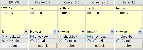
Compact live mini-form on the right contains all form elements except input type=file and input type=image. Form fields labels is skiped due to form simplicity. Form elements are as close together as possible to keep compact appearance.
The mini-form is created for testing of CSS property outline and pseudo-class focus of form elements. The second aim is to test crossbrowser form look. The form may be filled with text, but can not be submitted for processing.
Border of form elements are removed and then new border is created by the help of table dark background. One-pixel space between form elements, which creates new border, is set up thanks to attribute cellspacing="1px" in element table. It is possible to format the form with help of div elements, principle is the same. Some form elements are switched to the classic look by utilization of property background.
Following CSS code is used for styling of mini-form elements. Preliminary declaration DOCTYPE switch IE to standard mode, then box model can used for calculating the size of the elements. Form font is defined directly for elements, although universal selector *{} can also be used (font is not inherited from body, or html). For each element is provided CSS class named according to a form element.
<!DOCTYPE HTML PUBLIC "-//W3C//DTD HTML 4.01//EN"
 "http://www.w3.org/TR/html4/strict.dtd">

<style type="text/css">
input, select, textarea {font: normal 13px Arial, SansSerif, Verdana;}

.textBox  {width: 104px; height: 18px; margin: 0; border: 0; padding: 0 4px;
           float: left; background: #ffc;}
.textArea {width: 108px; height: 74px; margin: 0; border: 0; padding: 0 0 0 4px;
           float: left; overflow: auto; background: #ffc; resize: vertical;}
.select   {width: 112px; height: 20px; border: 0; margin: 0; background: #ffc;}

.checkBox  {margin: 2px 5px 0 5px; padding: 0; float: left;}
.radioBt   {margin: 2px 5px 0 5px; padding: 0; float: left;}

.submit {width: 112px; height: 22px; border: 1px outset #fff;}
.submit:active {border-style: inset;}
input[type="submit"]::-moz-focus-inner {border: none;}
</style>
Comments on individual elements
Form elements often occupy empty, unused space around them. Empty space depends on the element type and on the type of browser. To remove the empty space by setting margin: 0; is not always successful. Usually it is necessary to use a property float for eliminating, in this case unwanted, space.
.textBox
Element <input type="text"> occupies empty space arround in some browsers. To remove that space, property margin: 0; and float: left; is used. Setting padding: 0 4px; keeps visible text cursor even at the right side of element and indent text on both sides of element. Total width of element is 104 + 2 * 4 = 112 pixels, where 104 is inner width of element in pixels.
.textarea
Also in this case empty space around the element was eliminated by property float: left;. Text indent is on the left side only, therefore padding 0 0 0 4px; is used. Internal width of the element is 108px;. The total width of the element is 108 + 4 = 112 pixels. Vertical scroll bar appears after all available space is filled up by text thanks to property overflow: auto;.
.select
Browsers IE6 and IE7 draws the element <select> including border. Experimental borderless select is not used here, because that solution does not allow to use pseudo-class focus for drawing the outline arround active element. The width of this element is calculated according to the traditional box model, therefore, the width is set across of the form: 112 pixels.
.checkbox and .radioBt
Vertical alignment of elements <input type="checkbox"> and <input type="radio"> is unified by properties padding: 0; float: left;. Relative alignment to supporting text is attached by property margin.
.submit
Dimensions of element <input type="submit"> are calculated according to traditional box model, therefore final dimensions are specified. Border of submit button is created by property border: 1px outset #fff;. When the button is clicked, pseudo-class active is involved and property border-style is changed to inset. That replace the colors of border. Dotted box around the text inside the button in Firefox is removed by specific property: -moz-focus-inner. For this case attribute selector is used.
Unfortunately, in IE8 when clicking directly on the title text inside of button property border-style: inset; is not applied. Clicking the button beside text works as expected. Older IE do not change the border at all.
Form elements and focus
Interactive web page elements (hyperlinks and form elements) may capture focus. At one moment, only one element in the page can be captureed by the focus. Moving focus to next element is performed by pressing Tab key. Text from keyboard is routed to that element with focus. By this way the web page in browser can be controlled only with help of keyboard, without using mouse.
In browsers IE, Firefox and Opera elements input=text and textarea with focus are recognized by blinking text cursor, other elements are marked with a dotted outline. In browsers Chrome and Safari focus is indicated in very effective way: around the active element is displayed visible colored box as shown in the following screenshot.

Search for focused element in a larger form, with dozens of text boxes, according to the blinking text cursor is not easy. Also doted outline rather degrades many nice websites. Fortunately, modern browsers allow to modify the look of an element that has focus. CSS property outline is convenient for this purpose since it does not change the layout and the size of elements.
Other CSS properties (change font, add border) can affect the layout of the page. Setting the background property of a form element causes the switching form elements to the classics look. On the contrary, changing the background color and removing the dotted outline of hyperlinks with focus can enhance the page effect.
<style type="text/css">
.
.
input:focus    {outline: 1px solid #962; outline-offset: -1px;}
select:focus   {outline: 1px solid #962; outline-offset: -1px;}
textarea:focus {outline: 1px solid #962; outline-offset: -1px;}
</style>
Pseudo-class focus is applied only when the element has got the focus. Original focus mark is replaced by new mark: brown outline of width 1 pixel. Color, type and width of the outline contour can be specified. Except for IE8, also outline-offset property can be specified to adjust the distance of offset from the outer edge of the element. FireFox and Opera, unfortunately retain the original dotted box, quite confusing.
There are some problems when using property outline. If the form elements are too close together and the width of outline exceeds the elements spacing, part of outline is clipped. Correct outline is shown only in Opera. IE6 and IE7 does not display focus at all, IE8 can not handle the offset property. Chrome and Safari use default outline-offset:-2px;. Setting outline-offset:-1px; covers dotted contour for checkbox and radio in FF and Opera. outline-offset:-3px; covers dots for button in Opera and in FF it is possible to remove dots for submit button by specific property -moz-focus-inner {border: none;}.
To remove dotted outline for anchors, setting a:focus (outline: none;) are often recommended. That is not the best solution, because it is not possible to locate which element has got focus then. Better solution is to set a thin outline with a neutral color, or the background of anchors: a:focus {outline: none; background: # ccc;}.
Focus activation differentiates across browsers. In IE and Firefox focus of the form elements and anchors is activated by Tab key, or by mouse click. In Chrome and Safari form elements are activated by Tab key or by mouse too, while the anchors are activated only by key Tab (browser resolves whether keyboard or mouse is used for page controlling). How simple and elegant. Why this is not possible even in IE and FF?
updated 23.05.2010