
Average and Standard Deviation graph
Sometimes we need to display thousands of values on a small place. In such a case statistics have to be used. Average and variance (Standard Deviation, STD, sigma) values are calculated for each data set. These two statistical quantities can replace hundreds of measured values.
This method is used in intranet application Weighting and in application Gauging. In the second one there is no screenshot of this type of graph and I get right that now.
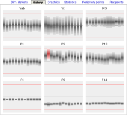
On gauging screenshot is history of 9 measuring points. Each single column represents 10 minutes interval of measurement (circa 100 values for each bar). According to average and standard deviation values each bar in graph is modified.
In upper and middle parts of screenshot there are values with good average, but high deviation. Dimmensions are not to much stable. One red column even indicates limits overrun and in this interval probably some products were rejected because of out of limit dimmensions.
In lower part are very stable dimmension points. Even if average values are distant from set point (central line), thanks to very low deviation there is no probability of cross over limits.


For explanation of basic priciples how to display average and standard deviation in one graphics element, I selected middle graph from screenshot. First prepare background picture with marked limits and set point. Distance of limit and set point will be our graphic scale. Next two bar pictures will be used for bar graph drawing.
Bar image is filled so that in the centre of bar dark colour is used (mark average), towards top and bottom light colour is used. Fill style should imitate Gauss curve gradient, but in example linear gradient is used with increased accent to dark color in the centre of bar.
When height of bar is set to different value than original, browser recalculates the size and keeps original shape of bar. Therefore only one bar image is needed for entire graph.
For graph drawing we have to calculate position top and height of each bar in column graph. Algorithm is not discuseed here, only remind you that, bar height is 6*STD (±3*STD), according to theory in this space would have lie down all values of base data set. Top and height values must be rounded to integer. Do not forget test for graphics scale overrun.
Here also test for limit overrun is used for bar color setting. Red bar should require machine setting control intervention.
<style type="text/css">
.cbg {width: 158px; height: 120px; background-image: url(/at/files/STDbg.png);}
.con {position: relative; width: 12px; height: 120px; float: left;}
.bar {position: absolute; width: 11px; left: 0; border: 0;}
</style>

<body>

<div class="cbg">

<div class="con" title=" 06:50, avg=54 ">
<img class="bar" src="/at/files/STDbarGray.png" style="top: 17px; height: 42px;" />
</div>

<div class="con" title=" 07:00, avg=70 ">
<img class="bar" src="/at/files/STDbarRed.png"  style="top: 10px; height: 42px;" />
</div>

...
</div>

</body>
Three classes are declared for graph drawing in CSS section. Class .cbg is container for entire graph and draws graph background. Class .con is container for one graph column and position: relative is assigned, so that it is possible to use position: absolutely inside of this container, where class .bar is used for visible graphic element <img>. This element has assigned too inline style for calculated top and height positions.
In this example other method for numeric data display is used. Instead of calling function onMouseOver() atribut title is used in container. Server script inserts here measurement time and average value. It is not so impressive method as in last article, on the other hand it is more simpler.
It would was possible to fill in graph bar by other method (SVG, VML, MS filters). Described way is simple and universal, even if there is visible difference in bar quality displayed in original and modified height.
updated 03.12.2006