
Intranet application Weighting
Product weight is frequently monitored parameter. In our case weight affects occurrance of some defects. Gradual presure to increasing yield led to implementation of automatic weighing machine, which is able to measure up the weight of hot glass moulding in 6 seconds interval, including inevitable glass moving.
At that frequency of measurement it is not possible to watch each single weight value and to make correct control intervention decision. In such a situation we diceded to use computer as an intelligent recorder.
From technological point of view automatic weighting machine transmits measured value over serial port. Custom made program reads and filters weight data, adds time of day and result stores to the database. Here described intranet application reads data from that database and makes data visualisation.
There is a question: how to display one shift data range (some 10 000 results) in one page, so that we get simple, transparent and full shift range graph. The answer is in the picture below: data are grouped to ten minute blocks (one block represents up to 100 values), average and standard deviation values for each data block are calculated. Ten minute block is displayed as one modified bar graph column. Shape of bar simulates both average and deviation.
For this purpose, picture of bar is prepared so that in the centre of picture is used high deep colour, toward to top and bottom chroma decreases. At little imagination such a picture can simulate Gauss curve. Proper positioned and high modified picture represents one 10 minute data block then.
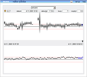
In screenshot you can see last 8 hours of weighting data in upper graph. You can see about 30 minutes of production downtime, followed by high standard deviation caused by adjusting after press machine restart.
When moving mouse over graph, numeric data of each column graph are displayed above graph. You can take notice of select element for history display. The history is maintained to the maximum depths of 1 week.
In bottom part of screenshot is graph of all values in selected 10 minute interval. There is no statistics in this graph, real values only. It is possibile to unpack any 10 minute interval by clicking on desired column in upper bar graph. Little arrow between both graphs indicates which interval is unpacked.
As a matter of fact, the application is just one page. Another small page is needed for set point entry after production job change. This value is used for vertical graphs scaling.
updated 02.07.2006